Our brand
identity
‘Brains’ and ‘bricks’ – a symbiosis of expertise and passion.

‘Brains’ and ‘bricks’ – a symbiosis of expertise and passion.
The company name, Branicks exudes self-assuredness by cleverly blending the English terms ‘Brains’ and ‘Bricks’. It symbolizes the minds that passionately and competently create what can arise from solid foundations.
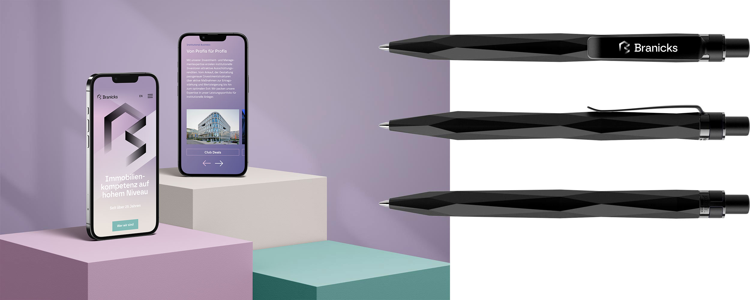
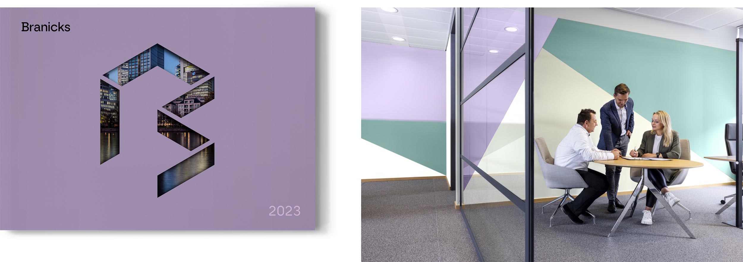
Light is one of the most crucial elements in architecture. It provides spaces with definition – for living and working. In the corporate design, light takes on the role of the leading brand element, represented by the key visual ‘Lightbeam’. The design is also characterized by a distinct color palette that revolves around the primary hue ‘Lilac Sky’, making it a defining element.
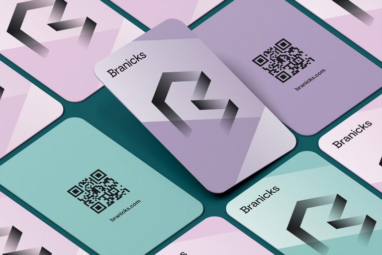
The Branicks ‘B’ is the central symbol which the brand confidently presents itself to the recipients. The open structure of translucent gradients, with its three-dimensional appearance, evokes spaces and architectural forms. Simultaneously, the visual mark represents transparency, openness, and creativity. The additional design elements of the corporate design embrace the isometric style of the logo.
The corporate design is the central element of the brand identity. It provides the brand with a consistent and unified visual presence. The style guide outlines the design elements and assists in their correct usage. The download area is password-protected. If you require access to this area, please contact marketing@branicks.com.